Past Projects
Explore our past work to become inspired, see what we are capable of, and see how we may elevate your brand.
Organize past projects with the words below
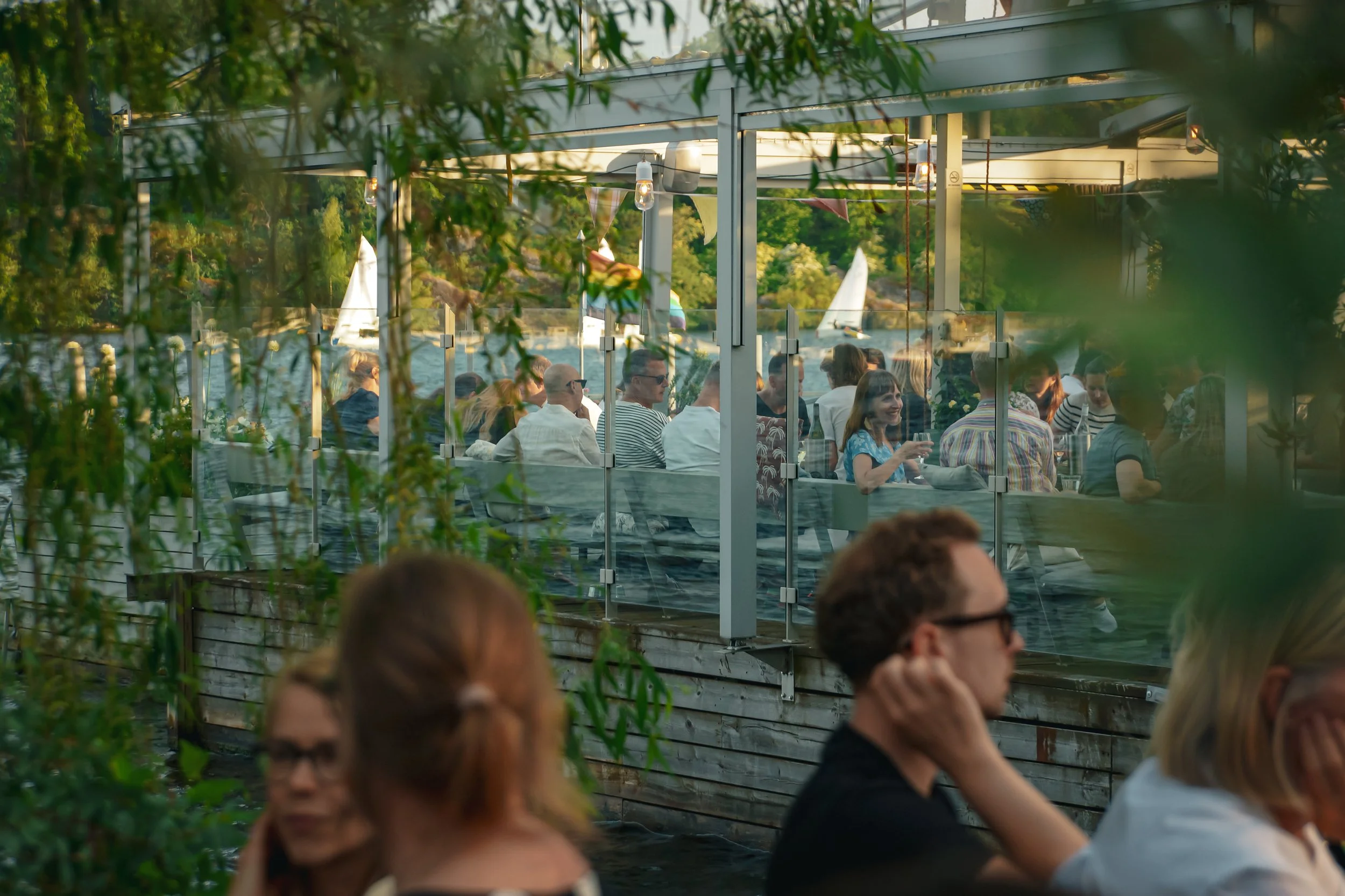
Mälarpaviljongen | Social Media Campaign 2024
From March to August 2024, ZFMK Creative partnered with Stockholm’s iconic waterfront restaurant, Mälarpaviljongen, to shape its digital presence during its twentieth season. Our role encompassed social media management, campaign planning, and content creation across six platforms, aligning online storytelling with Mälarpaviljongen’s inclusive and vibrant identity.
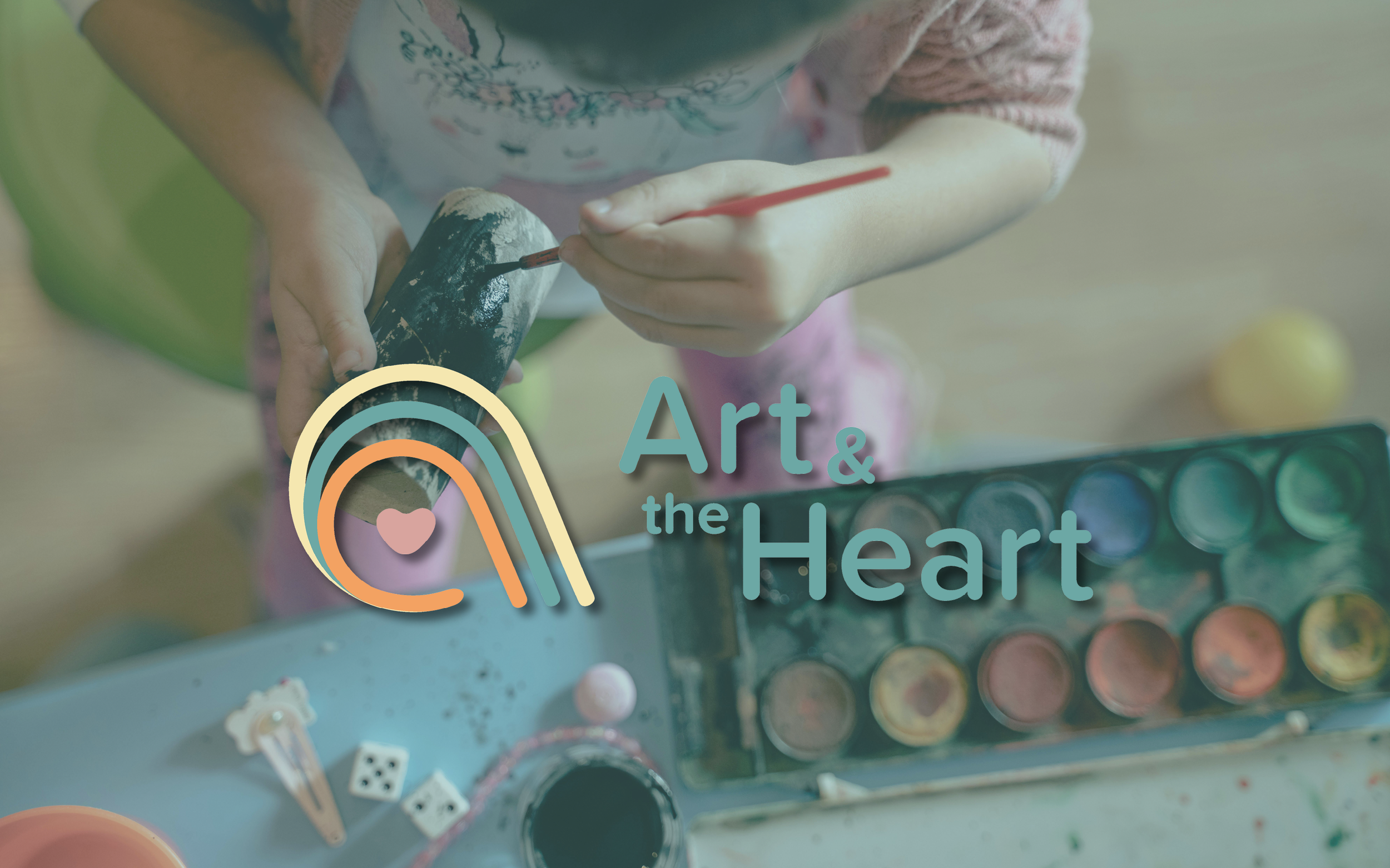
Shaping Identity – Art & the Heart
ZFMK Creative partnered with Art & the Heart to develop a brand identity rooted in healing, creativity, and connection. The project included a custom logo system, color palette, supporting graphics, and a comprehensive branding guide. Everything was designed to reflect the organization’s mission of making emotional well-being accessible through art.

Anchored Identity – The Cleat Branding
As The Cleat prepared to open and introduce itself to the Sister Bay and Door community, we led a comprehensive branding refresh focused on flexibility, clarity, and long-term usability. By evolving the existing logo into a scalable system and pairing it with a defined color palette and content framework, the brand was positioned to show up consistently across every guest touchpoint.
LNRP 2023-2024 Impact Report
ZFMK Creative was selected by Lakeshore Natural Resource Partnership (LNRP) to design their 2023-2024 Impact Report—a comprehensive six-page document that showcases the organization’s conservation efforts, partnerships, and financial transparency. Our goal was to create a visually compelling, functional, and engaging report that aligns seamlessly with LNRP’s brand while making complex information accessible to their stakeholders.

Sunday Service with Tech Metropolitan
Tech_METROPOLITAN (TM), inspired by its founder’s Louisiana roots, creates inclusive spaces for Baltimore’s queer community to celebrate art, culture, and individuality. ZFMK Creative designed adaptable graphics for TM’s "Sunday Service" event, including a rainbow disco ball and radiant light shards, with plans to expand these assets and continue supporting TM’s creative initiatives.
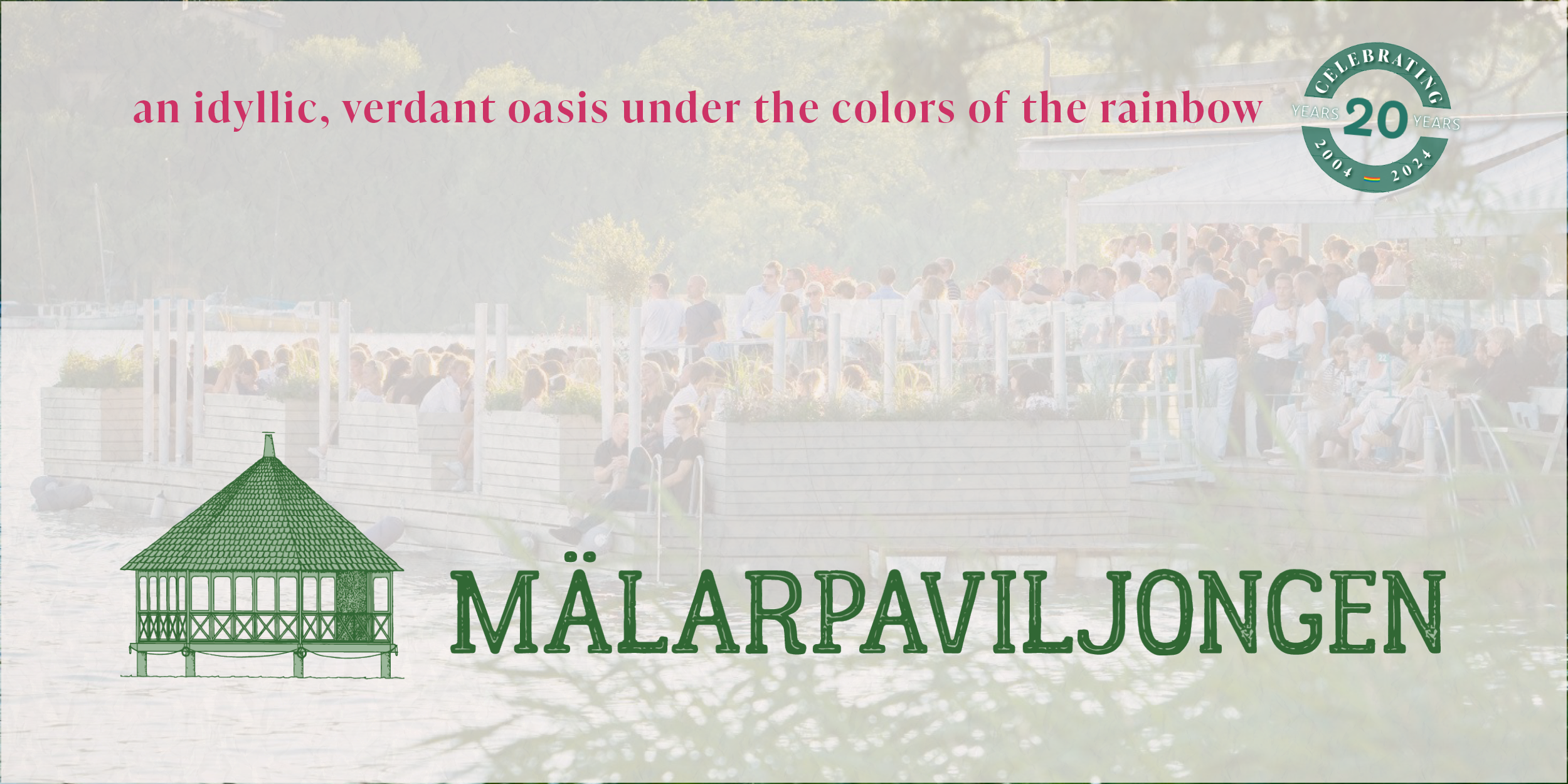
Refreshing Mälarpaviljongen: Elevating the Brand Experience
In preparation for the twentieth season, we undertook a comprehensive rebranding effort to refresh the iconic Mälarpaviljongen logo to enhance visual appeal and functionality. By integrating a cohesive color palette and versatile logo designs, we successfully elevated Mälarpaviljongen's brand experience, aligning it with their identity and customer expectations. The project also involved developing content standards and templates for their social media channels to ensure consistent and high-quality engagement across platforms. View the newly refreshed identity of a beloved Stockholm restaurant.
From the Ground Up: Renewed Menus for Mälarpaviljongen's Milestone
In celebrating its two-decade milestone, Mälarpaviljongen undertook a comprehensive menu revitalization, aligning with its commitment to bringing people together and creating an exceptional waterfront experience. Inspired by the venue's distinctive locale, the menus feature a harmonious blend of typographies and colors, while iconic symbols pay homage to its verdant surroundings. Looking ahead, the integration of supporting motifs promises to fortify brand identity across various graphics, fostering a cohesive and immersive dining experience for guests throughout the 2024 season and beyond.

English Bull Dog to Represent The Brinsmere Funds
This logo design showcases the iconic English Bulldog, symbolizing trust, forward-thinking, and approachability. In this project, we've meticulously crafted three dynamic logo versions - the standout icon, a sleek ribbon for official documents, and a bold stacked version. Our design choices prioritize high visual appeal, ensuring a strong online presence that is perfect for social media engagement. With a color palette inspired by trust and professionalism, and a clean aesthetic against a white backdrop, this logo embodies our commitment to financial stability and innovation. Dive into our project to witness how our branding captures the spirit of The Brinsmere Funds.
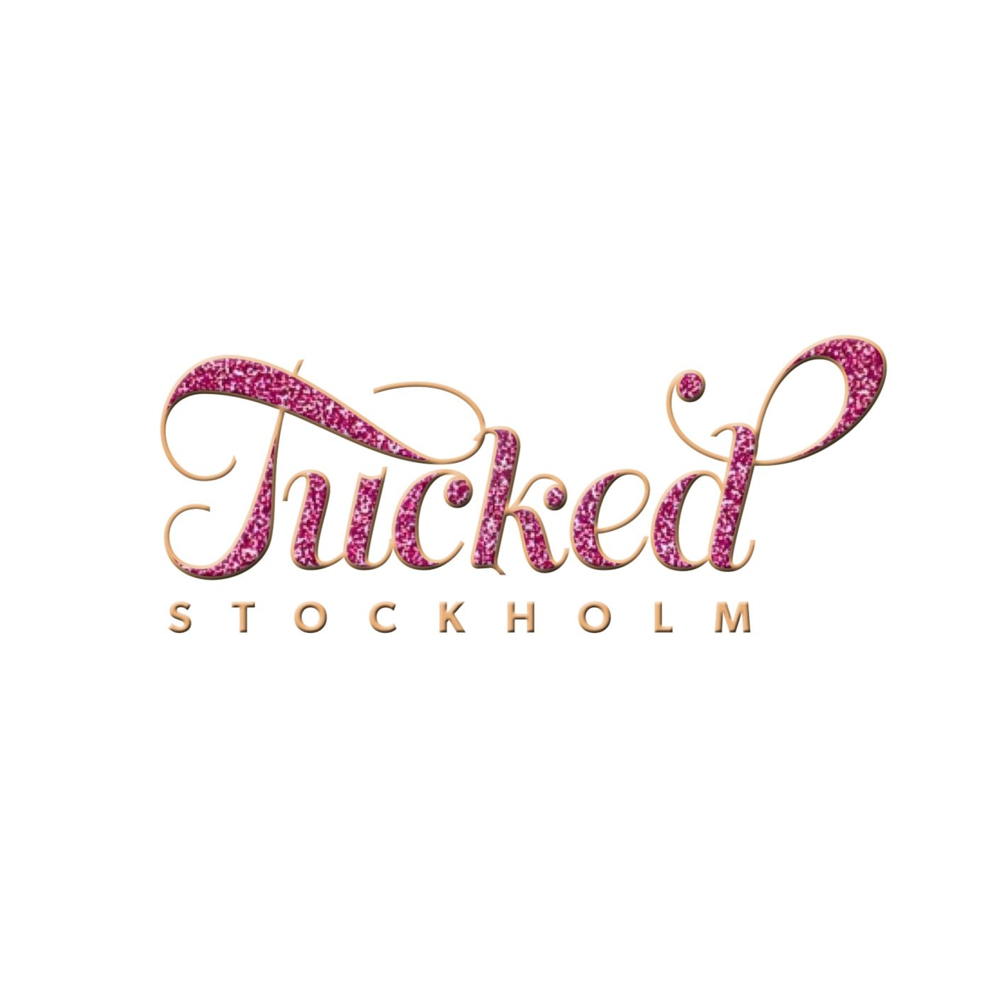
Tucked Stockholm Logo
Mälarpaviljongen sought a logo for their event series "Tucked Stockholm," inspired by drag performance culture. The resulting playful yet delicate text-based design with pink glitter captured the essence of sparkle. This logo adorned event graphics, including posters and social media visuals, showcasing the brand's identity and inviting further exploration.

Ubuntu ASAP | Full Social Media Campaign
What does it take to build a nonprofit brand from the ground up—one that educates, empowers, and inspires across continents? For Ubuntu ASAP, a new international architecture program, the challenge wasn’t just launching a competition; it was crafting a digital presence that spoke with clarity, compassion, and purpose. Over the course of a year, ZFMK Creative helped define and deliver Ubuntu ASAP’s voice, visual language, and outreach strategy across social media platforms.
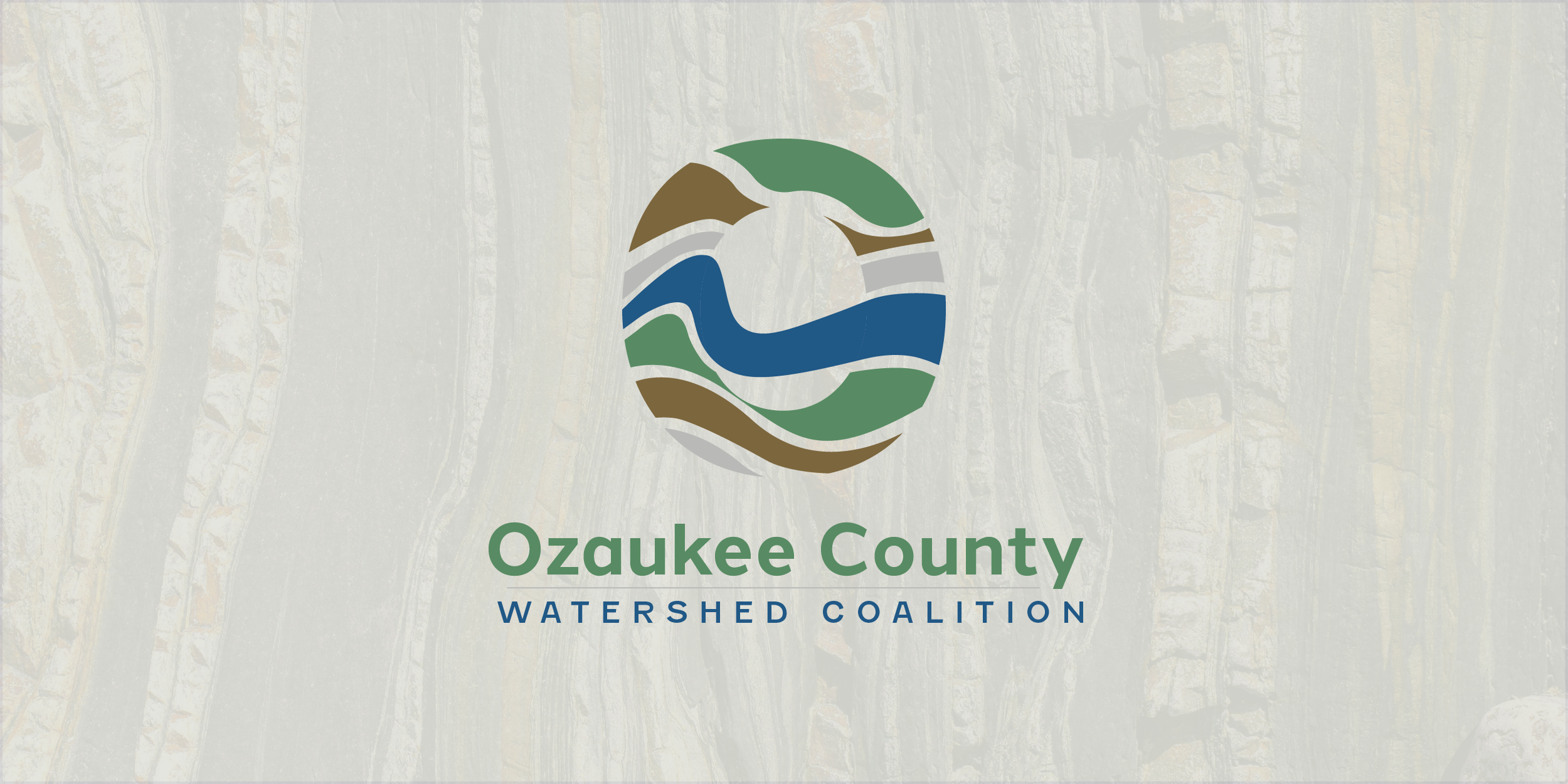
Oz Logo + Branding
Ozaukee County Watershed Coalition was a young organization looking to build branding to better establish itself in Wisconsin. Seeking a logo and branding to help ensure future growth is done with one voice and be recognizable to the communities it serves was at the foundation of discussions. The finalized design pulls from the layers within a watershed and shows the layers beneath the ground that help purify and hold the water people enjoy at the surface.

Saturated Labels
Your taste buds will be Saturated after enjoying this ice cream with labels designed by ZFMK Creative. With an idea from the leadership at this plant-based ice cream company in Nashville, a scalable and easily editable container label template was created.
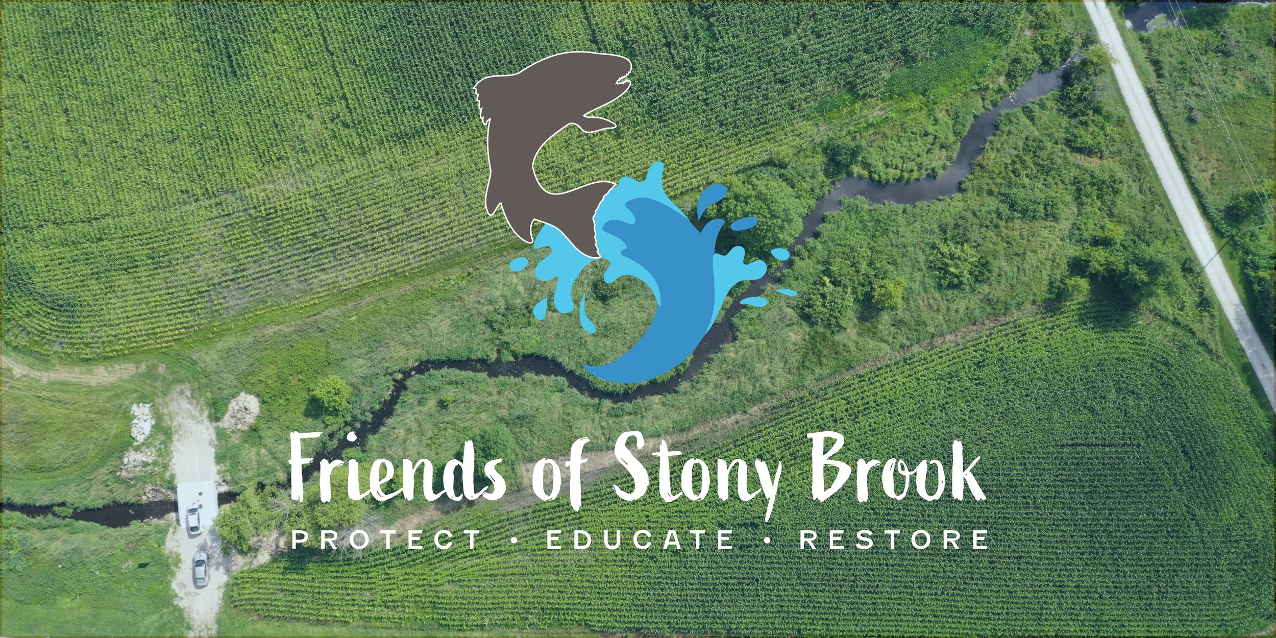
Friends of Stony Brook Logo + Branding
Friends of Stony Brook had been around for a number of years but was seeing more attention and growth in recent years. The organization was seeking a logo and branding to help ensure this growth was done with one voice and be recognizable to the communities it serves. The end result incorporates many elements from the activities within Stony Brook and accentuates the protection, education, and restoration of the area.

Ubuntu ASAP | Design Brief Promotion Assets
Following the completion of the official Ubuntu Architecture Summer Abroad Program Design Brief, ZFMK Creative developed a strategic suite of branded graphics and promotional content to announce the competition launch and drive program participation. These assets supported Ubuntu ASAP’s inaugural design/build class in collaboration with Ubuntu Design Group and Design Class, inviting students worldwide to propose a home for the Ngcobo family in rural South Africa.

Ubuntu ASAP | Architecture Competition Design Brief
ZFMK Creative was selected by Ubuntu Architecture Summer Abroad (Ubuntu ASAP), in collaboration with Ubuntu Design Group and Design Class, to develop the official design brief for their 2021 architecture competition and summer education program. This twenty-page document introduced students and early-career professionals to a unique design challenge: proposing a socially and environmentally sustainable home for the Ngcobo family in KwaZulu-Natal, South Africa.

Saturated Logo
Saturated Ice Cream out of Nashville, Tennessee, was seeking help to create a scalable vector file of their existing logo and to help with usage guidelines. A branding guide was established with the current colors, fonts, and usage of the logo so that future use could be achieved at any scale.

Creating a Livable Brand for Cherokee Island
Wesenberg Homes' logo for Cherokee Island encapsulates the essence of wooded waterfront living on Lake Winnebago, Wisconsin, through its thoughtful design. Inspired by the lush landscape, the circular arrangement of leaves symbolizes the abundant natural beauty and growth of the development, while the encompassing blue rings evoke the serenity of the surrounding water and recreational opportunities. With three distinct logo versions tailored for various contexts, Cherokee Island's branding captures the harmonious blend of nature and modern living, promising an idyllic retreat for residents.

Casey’s Meadow Logo
Introducing the Casey's Meadow logo by Wesenberg Architects, a seamless blend of simplicity and sophistication. The intertwining 'C' and 'M' symbolize the unity of community within this vibrant Oshkosh subdivision, while the golden hues evoke the serene beauty of the meadow, complemented by hints of blue reminiscent of nearby Sawyer Creek. Reflecting the essence of relaxed living and thriving families, our logo encapsulates the essence of Casey's Meadow, where new additions flourish amidst picturesque surroundings.

Cultivating a brand: Door County Thrive
Through collaborative dialogue with Door County Thrive's leadership, we embarked on a creative journey to craft a logo and brand reflecting their diverse community and shared mission of empowerment. Established in 2017 by passionate volunteers, Door County Thrive aims to cultivate eco-literacy and foster community collaboration for the greater good. Our logo, symbolizing unity and growth, embodies this vision, offering versatility across various platforms while preserving its significance for official communications and documents.

Base Camp Logo
Creating a logo for a business is an important step in establishing a brand and visual identity. A well-designed logo can help to differentiate a business from its competitors and create a lasting impression on potential customers.
