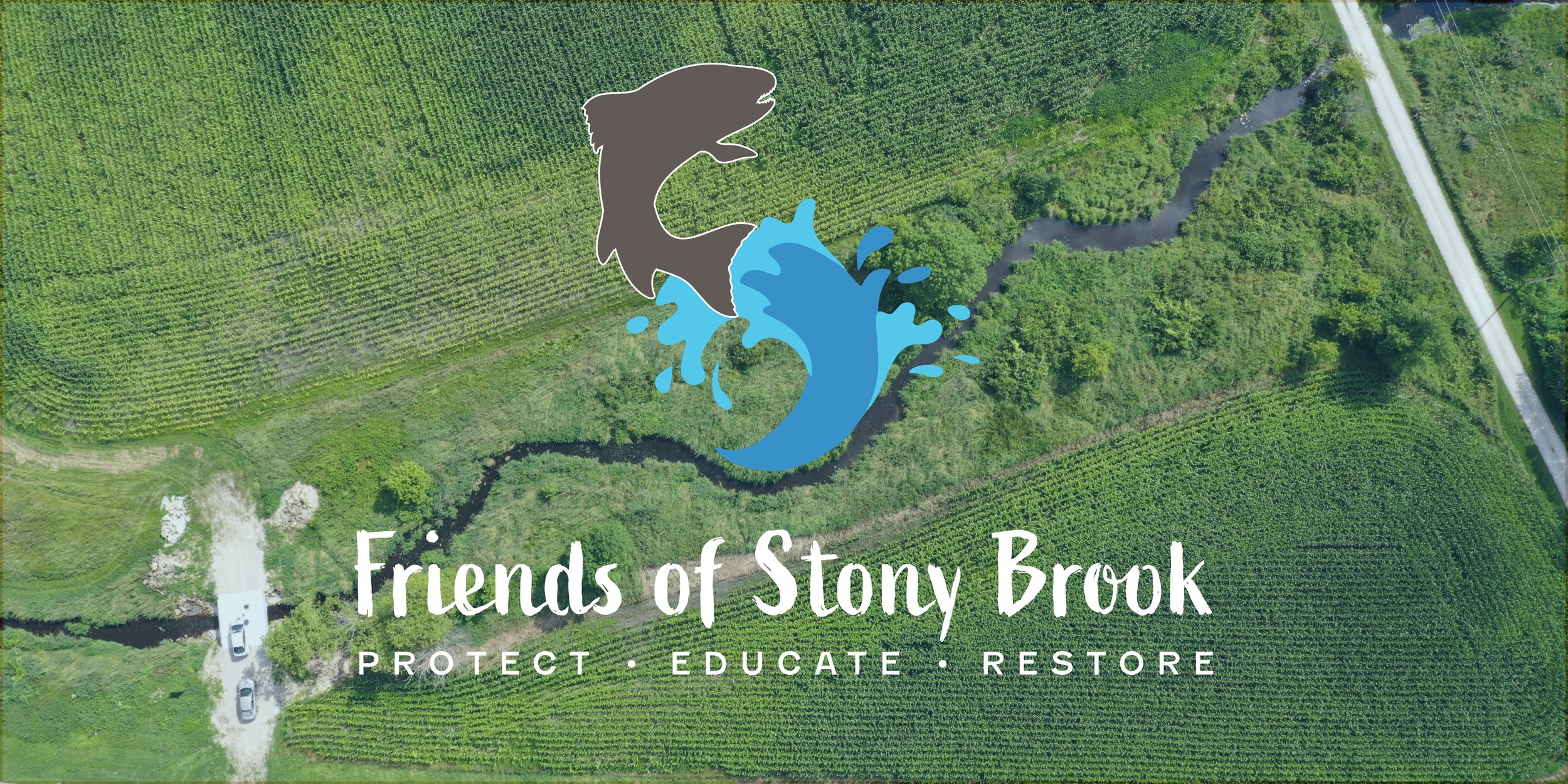
Friends of Stony Brook Logo + Branding
CLIENT
Friends of Stony Brook
LOCALITY
Chilton, Wisconsin
DATE
June 2021
CATEGORY
Branding
TYPE
Branding, Logo, Marketing
MEDIUM
Digital, Print
Friends of Stony Brook had been around for a number of years but was seeing more attention and growth in recent years. The organization was seeking a logo and branding to help ensure this growth was done with one voice and be recognizable to the communities it serves. The end result incorporates many elements from the activities within Stony Brook and accentuates the protection, education, and restoration of the area.
During the first meeting Friends of Stony Brook (FOSB) mentioned that beyond the brook being important, the connection to one of their biggest programs for students was a key element to their past and future. “Trout in the Classroom is a nationally recognized program and curriculum that is designed to make connections between classroom learning with the natural environment and to promote stewardship for the steam and surrounding landscape. Trout in the Classroom (TIC) is an environmental education program sponsored and supported by Trout Unlimited in which students in grades K-12,” says FOSB’s website. Lastly, the group wanted a possible connection with the letter “S” worked into the icon of the logo design.
With the three elements the organization was seeking to include in their logo, it meant including the water from the stream, a trout from their education programs, and an “S” to give a nod to Stony Brook. After providing a handful of concepts it was determined that the design shown above would be perfected and used to represent the group.
This design started with looking through images of trout to understand the fish in their natural habitat. Being fascinated with their jumping this search moved to vector images of trout so that the outline of the fish could be utilized. Creating a splash of water for the fish to jump out of helped the realization that the “S” shape could be created with the two elements merging together. This merge also signifies the strong relationship between the trout with the educational programs and its connection to the water of Stony Brook.
From this point, this is where the concept was presented to the client, from which the colors were tweaked to better represent the brand followed by the selection of typography. Two blue colors represent the water from the brook with Wenge representing the trout (a typical color of the fish). To counterbalance this darker palette, Vegas Gold was introduced as an accent color to act as the sunlight hitting the water creating a warm glow. Active and Fenwick fonts cement the logo and provide three typologies to use throughout the organization’s brand materials.
ICON
RIBBON
STACKED


