Oz Logo + Branding
CLIENT
Ozaukee County Watershed Coalition
LOCALITY
Port Washington, Wisconsin
DATE
October 2021
CATEGORY
Branding
TYPE
Branding, Logo, Marketing
MEDIUM
Digital, Print
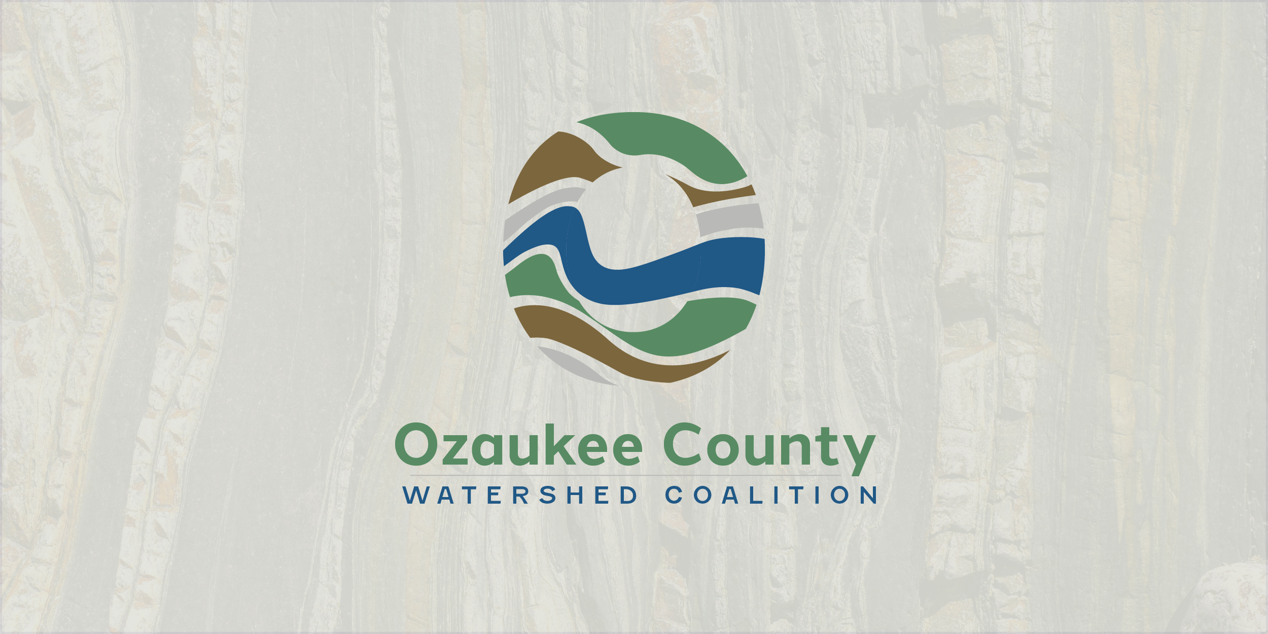
Ozaukee County Watershed Coalition was a young organization looking to build branding to better establish itself in Wisconsin. Seeking a logo and branding to help ensure future growth is done with one voice and be recognizable to the communities it serves was at the foundation of discussions. The finalized design pulls from the layers within a watershed and shows the layers beneath the ground that help purify and hold the water people enjoy at the surface.
In our initial discussions with the leadership of the Ozaukee County Watershed Coalition (OCWC), a vital insight emerged – the profound connection between land and the intrinsic value of water. That the organization be represented as “A conduit for information flow from local, state, and regional management agencies“ and “habitat restoration projects and water quality monitoring.” Recognizing these key elements, we embarked on a creative journey to craft a distinctive branding and logo for OCWC.
The concept of incorporating a map to emphasize the unique landscape, the vast waters of Lake Michigan, and the hidden watersheds beneath the county's surface took shape. Introducing a sedimentary effect by applying various colors to different watershed areas brought a dynamic quality to the design.
As the design evolved, we delved deeper into the layers of the earth that play a crucial role in purifying water. This exploration resulted in a visually captivating representation that not only showcases the beauty of the region but also underscores the environmental significance of OCWC's mission.
In a delightful twist, the organization's affectionate nickname, "Oz," referring to the Ozaukee County area, emerged as an unexpected yet fitting element to integrate into the design. This addition expanded the design's form, creating a distinctive "O" shape and revealing a subtle "Z" in the flowing blue ribbon – a symbolic representation of water weaving through the layers.
The final result is a thoughtfully crafted logo that encapsulates the essence of Ozaukee County's landscape, the purity of its water, and the vital mission of the Ozaukee County Watershed Coalition. Halcom and Fenwick fonts cement the logo and provide three typologies (icon, ribbon, and stacked) to use throughout the organization’s brand materials.
ICON
RIBBON
STACKED


