Past Projects
Explore our past work to become inspired, see what we are capable of, and see how we may elevate your brand.
Organize past projects with the words below
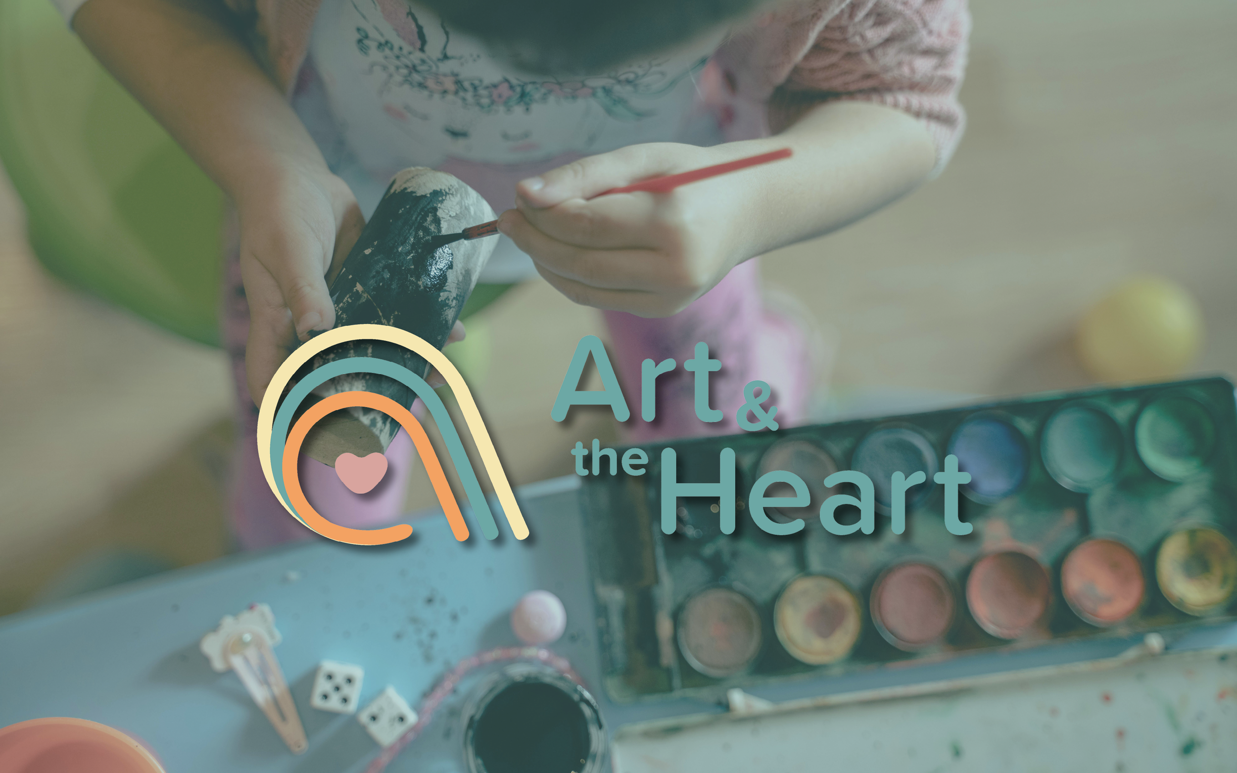
Shaping Identity – Art & the Heart
ZFMK Creative partnered with Art & the Heart to develop a brand identity rooted in healing, creativity, and connection. The project included a custom logo system, color palette, supporting graphics, and a comprehensive branding guide. Everything was designed to reflect the organization’s mission of making emotional well-being accessible through art.

Anchored Identity – The Cleat Branding
As The Cleat prepared to open and introduce itself to the Sister Bay and Door community, we led a comprehensive branding refresh focused on flexibility, clarity, and long-term usability. By evolving the existing logo into a scalable system and pairing it with a defined color palette and content framework, the brand was positioned to show up consistently across every guest touchpoint.

The Cleat’s Temporary Landing Page
Refreshing the online presence for Sister Bay’s newest waterfront restaurant, this project involved creating a clean, on-brand temporary landing page that reflects the energy of The Cleat while setting the stage for a future full-site launch.
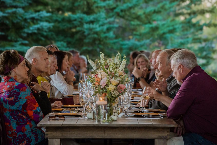
It’s Thyme! Capturing the Fall Harvest Dinner
Thyme Restaurant’s Fall Harvest Dinner, in collaboration with Twelve Eleven Wine Bar, delighted guests with a five-course meal celebrating Door County’s seasonal bounty. Set in a candlelit hoop house adorned with vibrant florals, the evening showcased local flavors and artisan wines for an unforgettable culinary experience.
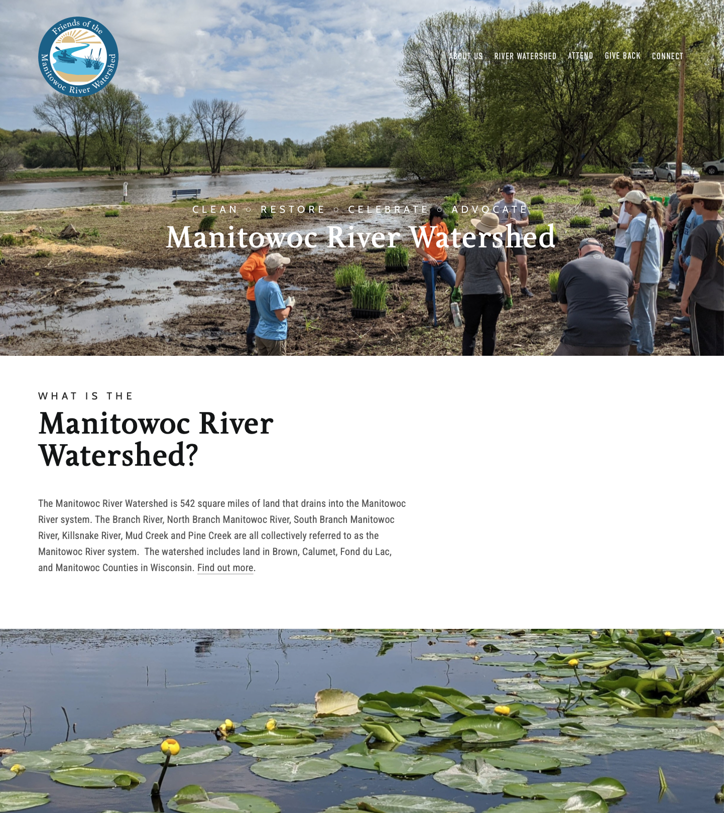
Friends of the Manitowoc River Watershed Website
Friends of the Manitowoc River Watershed embarked on a journey to enhance their online presence, seeking an interface for easy use and user navigation, the introduction of new content channels, and the integration of an event calendar. The aim was to create a user-friendly space that resonates with their audience.
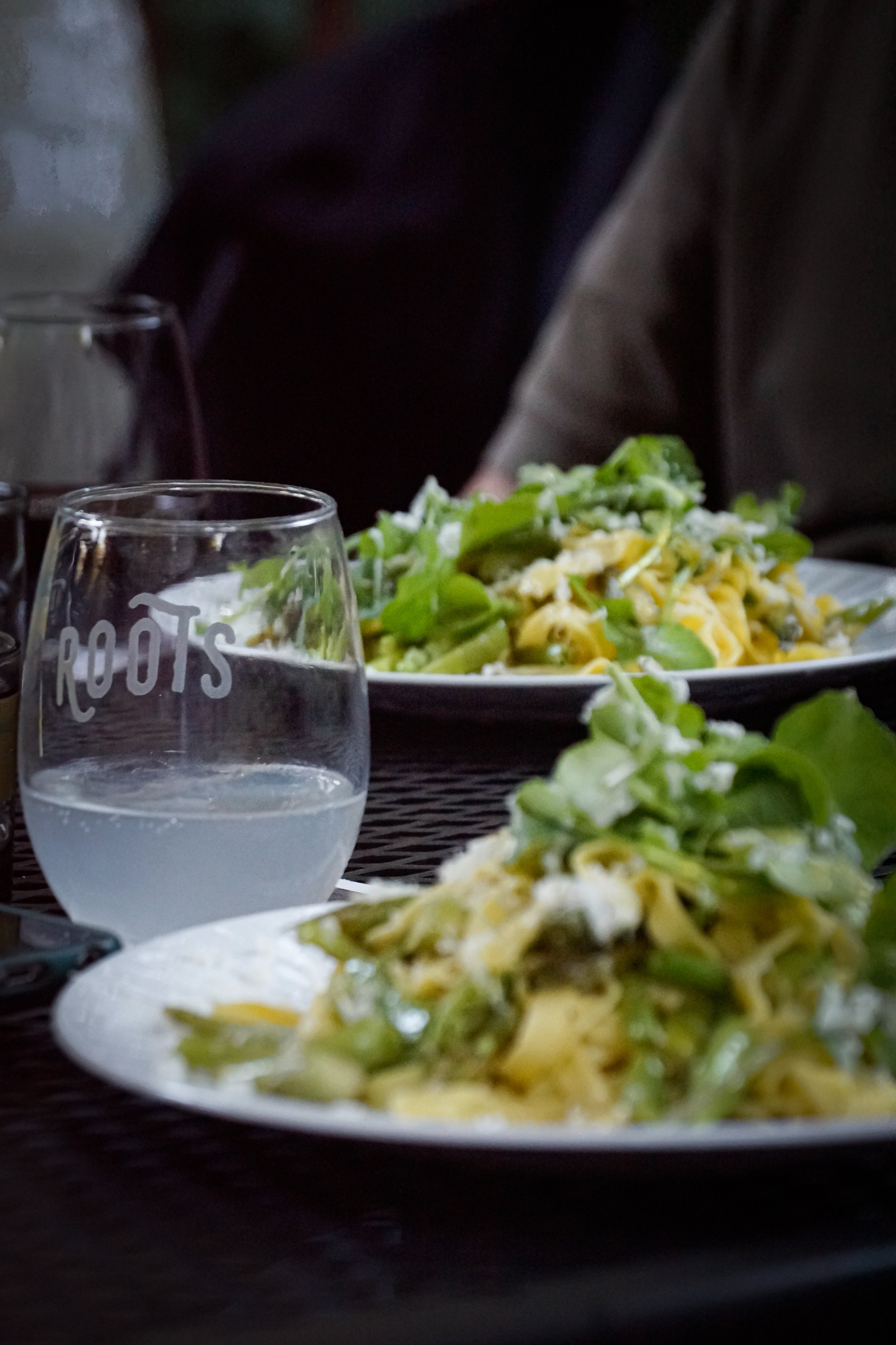
Roots Revealed: A Visual Exploration of Door County Underground
Door County Underground partnered with Roots Inn & Kitchen to curate a unique and flavorful four-course dining experience in Sister Bay, Wisconsin, featuring the culinary talents of Chefs Jamie Mead and Matt Chambas. By sourcing ingredients from local farms, the chefs celebrated the region's rural landscape, offering a menu that embodies creativity. This is a visual exploration of their menu at Roots revealed through images.

English Bull Dog to Represent The Brinsmere Funds
This logo design showcases the iconic English Bulldog, symbolizing trust, forward-thinking, and approachability. In this project, we've meticulously crafted three dynamic logo versions - the standout icon, a sleek ribbon for official documents, and a bold stacked version. Our design choices prioritize high visual appeal, ensuring a strong online presence that is perfect for social media engagement. With a color palette inspired by trust and professionalism, and a clean aesthetic against a white backdrop, this logo embodies our commitment to financial stability and innovation. Dive into our project to witness how our branding captures the spirit of The Brinsmere Funds.
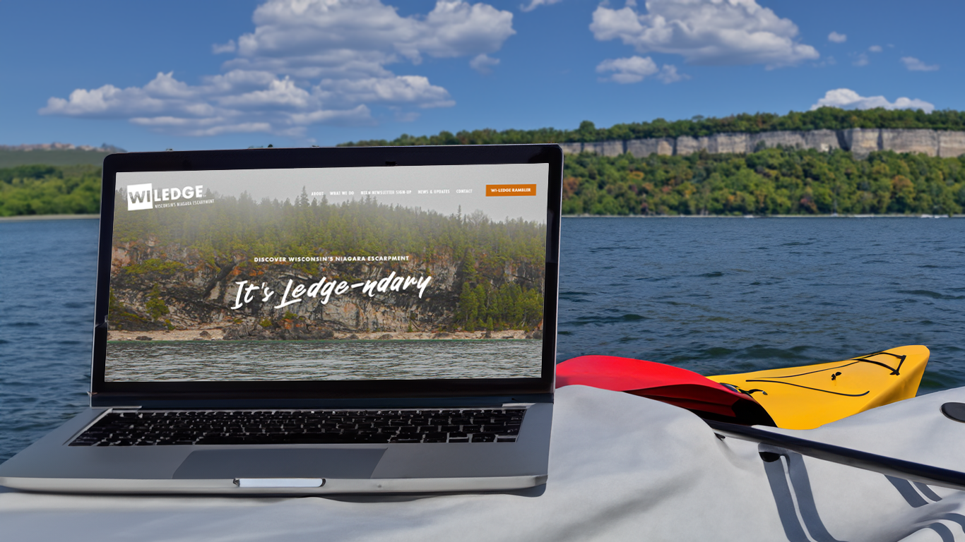
It’s Legendary: WI-LEDGE’s Website Upgrade
Wisconsin Ledge was seeking a refresh to their online interface to make it easier to navigate, host new content channels including the new interactive Rambler Map Guide, and improve the aesthetics overall. This new digital tool has increased their online visibility and allowed the organization to reach new so many new heights it’s legendary.

Reconnecting with Friends of Hika Bay
Friends of Hika Bay was looking to upgrade their ten-year-old website to better tell their journey of conservation of Hika Bay and the connected waters.
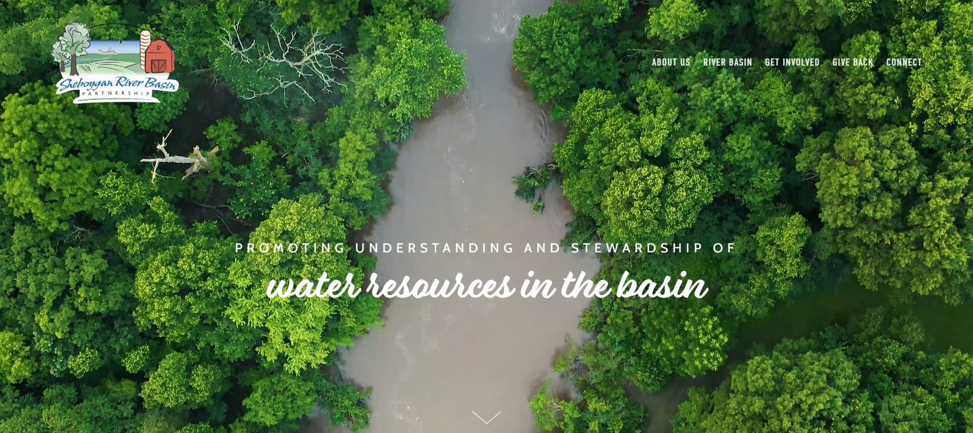
Promoting Understanding and Stewardship Online with Sheboygan River Basin Partnership
Promoting understanding and stewardship of water resources in the basin is now much easier with the completion of this online property. Completed with water quality reports, interactive mapping, and the history of the non-profit are just a few components within.
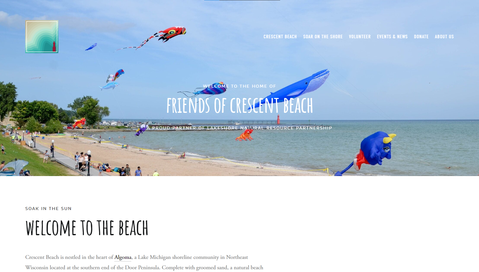
Web at the Beach: Friends of Crescent Beach Website
Friends of Crescent Beach sought an online property with the ability to organize their volunteers, gain new followers, and showcase their beach on Lake Michigan. With great digital assets including pictures, video, and graphics, this website really makes waves.
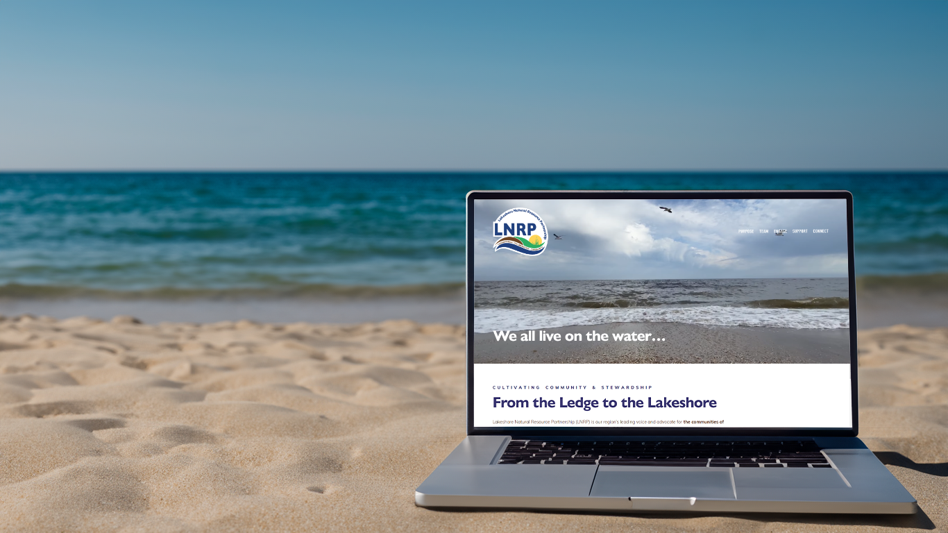
From the Ledge to the Lakeshore, a New Landing for LNRP’s Website
LNRP, a large umbrella non-profit, was seeking to refresh its outdated website with something that would get people engaged, provide benefits to their partners, and improve their conservation efforts in Northeast, Wisconsin. ZFMK Creative helps continue this transformation each year with larger updates and new features.
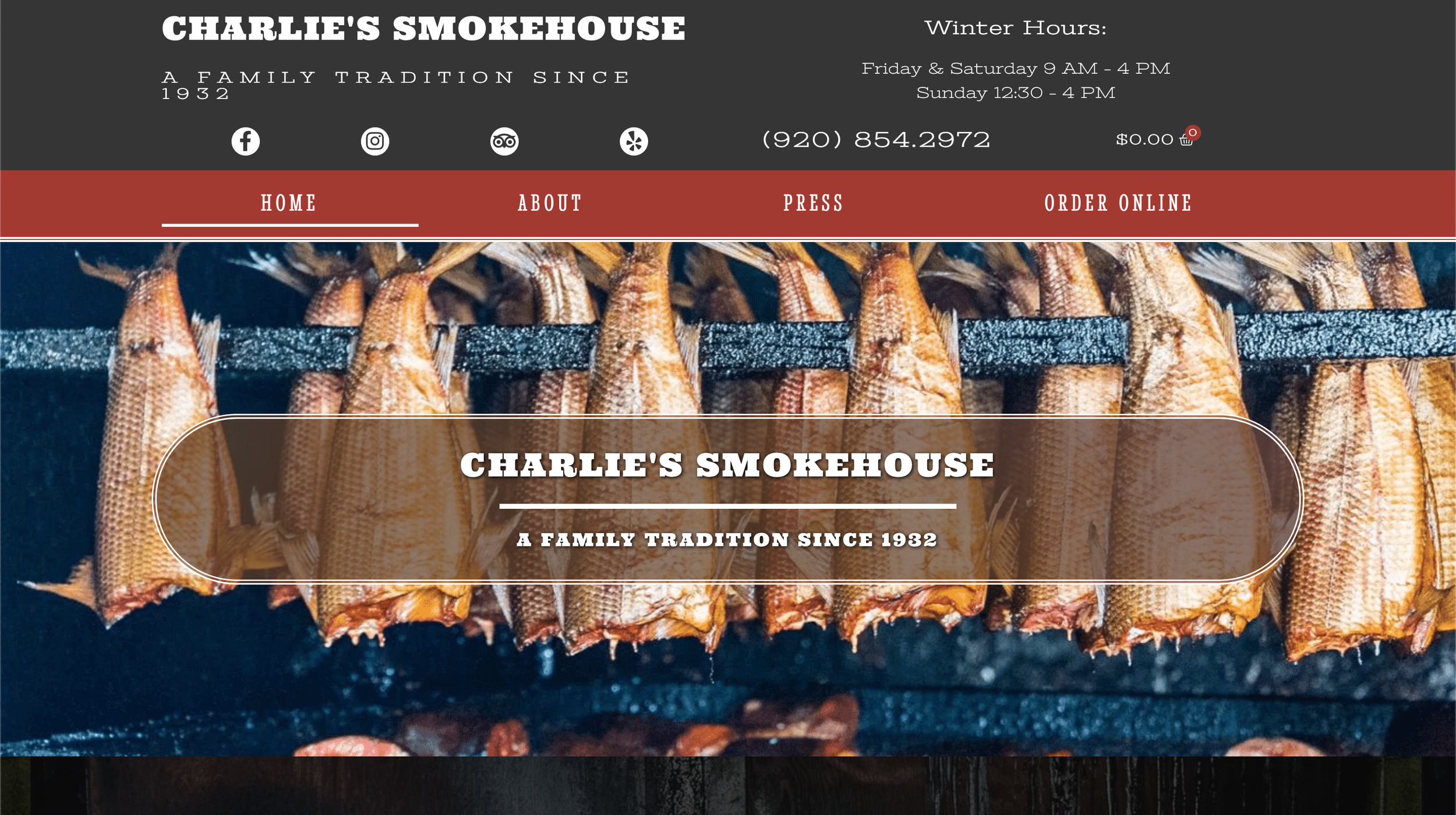
Organizing Charlie’s smokehouse website
Online properties can be a great resource for small businesses to utilize but can often be hard to learn the website builder. With this project, the current Charlie’s Smokehouse website was refreshed and brought to life with an online store, product descriptions, and a mobile version with an online ordering menu.

Creating a Livable Brand for Cherokee Island
Wesenberg Homes' logo for Cherokee Island encapsulates the essence of wooded waterfront living on Lake Winnebago, Wisconsin, through its thoughtful design. Inspired by the lush landscape, the circular arrangement of leaves symbolizes the abundant natural beauty and growth of the development, while the encompassing blue rings evoke the serenity of the surrounding water and recreational opportunities. With three distinct logo versions tailored for various contexts, Cherokee Island's branding captures the harmonious blend of nature and modern living, promising an idyllic retreat for residents.

Casey’s Meadow Logo
Introducing the Casey's Meadow logo by Wesenberg Architects, a seamless blend of simplicity and sophistication. The intertwining 'C' and 'M' symbolize the unity of community within this vibrant Oshkosh subdivision, while the golden hues evoke the serene beauty of the meadow, complemented by hints of blue reminiscent of nearby Sawyer Creek. Reflecting the essence of relaxed living and thriving families, our logo encapsulates the essence of Casey's Meadow, where new additions flourish amidst picturesque surroundings.
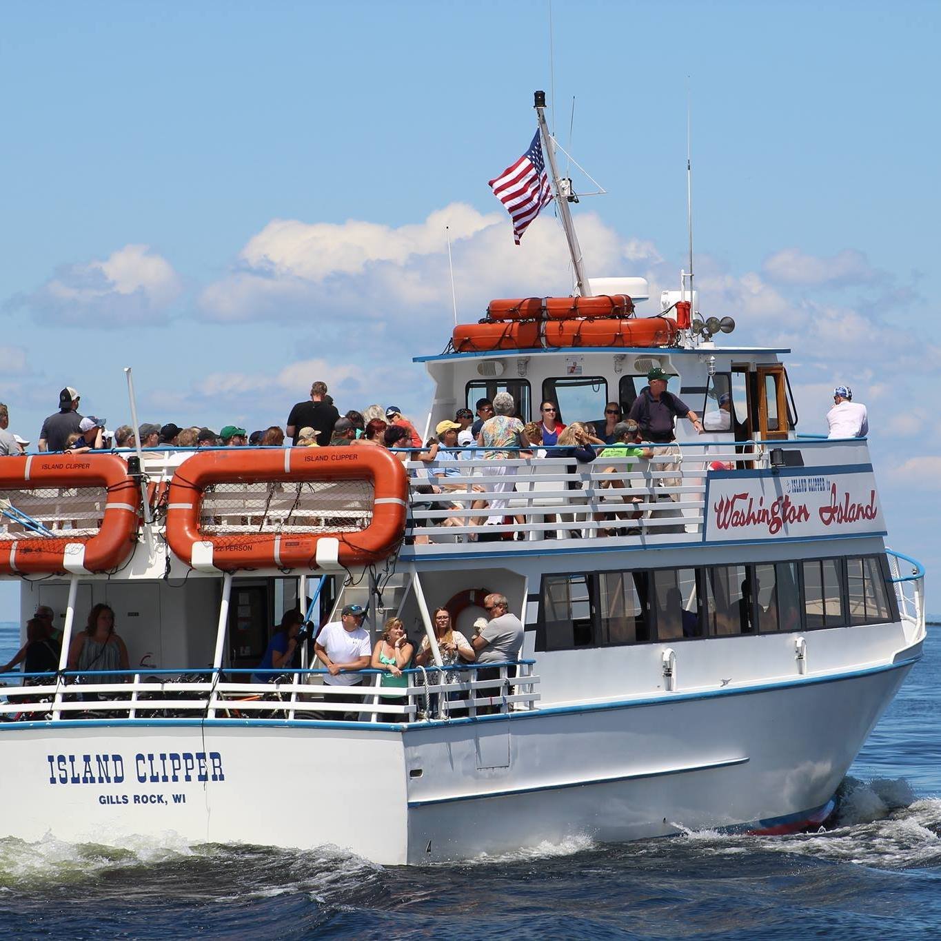
Island Clipper Ferry Website
A community favorite for traveling between the Door Peninsula and Washington Island was seeking to provide an online web experience for their customers and tourists to gain information about their fleet, schedule, and touring trains on the island. Island Clipper Ferry to Washington Island had a handful of custom elements created for their website to help it stand out and help tell its story.
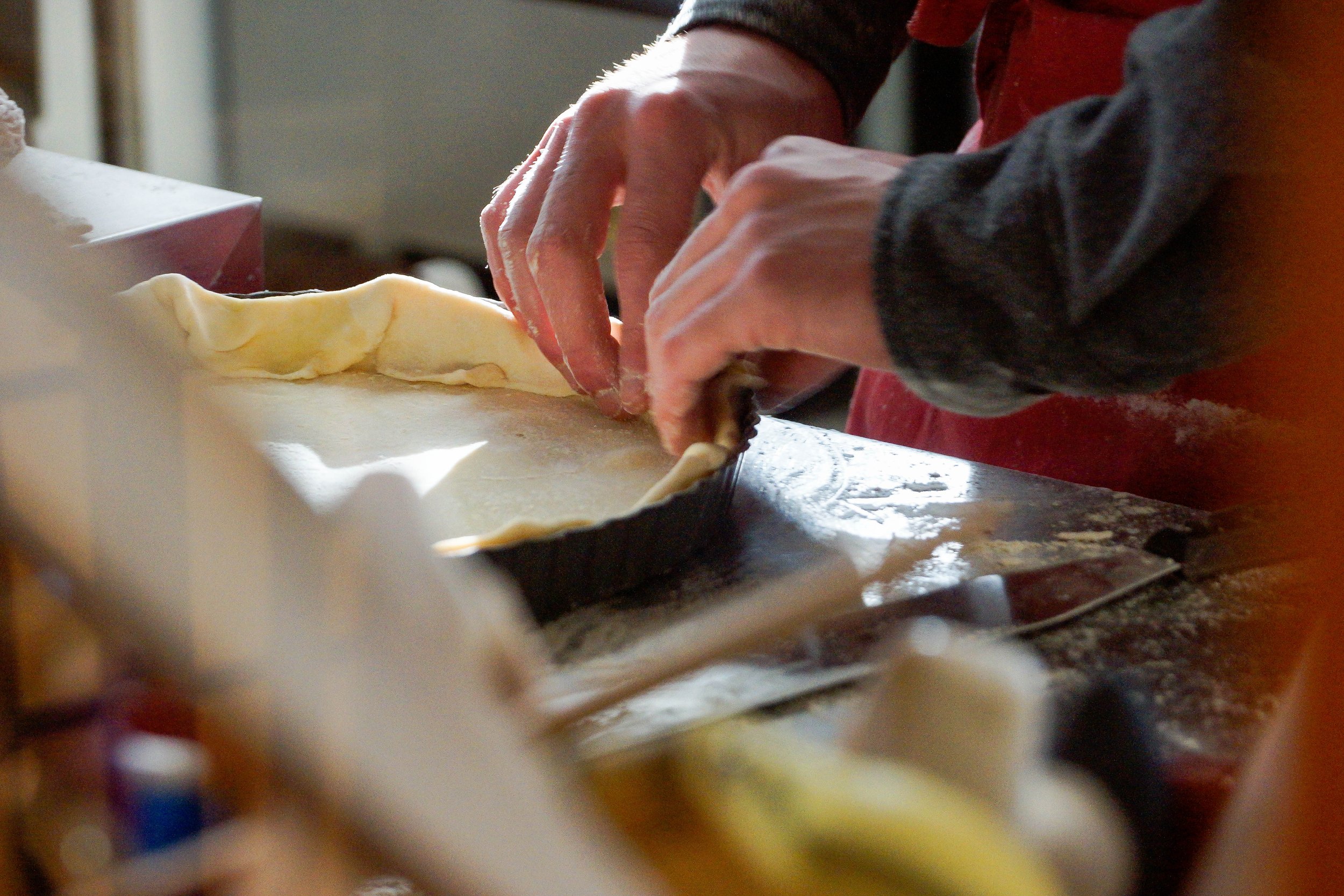
A French-Wisconsin Cafe Through Media
One of the firm’s first projects was in modernizing a popular cafe in the heart of the Door Peninsula, a thriving tourist destination surrounded by nature. Through solidifying Base Camp’s brand elements, re-inventing its online footprint, and creating an abundance of content to show what Base Camp provides to the community. This project took a few years to complete with planned sessions to capture the honest and compelling narrative of a French-Wisconsin-inspired culinary experience that brings many together.

Cultivating a brand: Door County Thrive
Through collaborative dialogue with Door County Thrive's leadership, we embarked on a creative journey to craft a logo and brand reflecting their diverse community and shared mission of empowerment. Established in 2017 by passionate volunteers, Door County Thrive aims to cultivate eco-literacy and foster community collaboration for the greater good. Our logo, symbolizing unity and growth, embodies this vision, offering versatility across various platforms while preserving its significance for official communications and documents.

Base Camp Website
Online properties can be a great resource for small businesses to utilize but can often be hard to learn the website builder. With this project, the current Base Camp Door County website was refreshed and brought to life with an online store, product descriptions, and a mobile version with an online ordering menu.

Base Camp Logo
Creating a logo for a business is an important step in establishing a brand and visual identity. A well-designed logo can help to differentiate a business from its competitors and create a lasting impression on potential customers.
