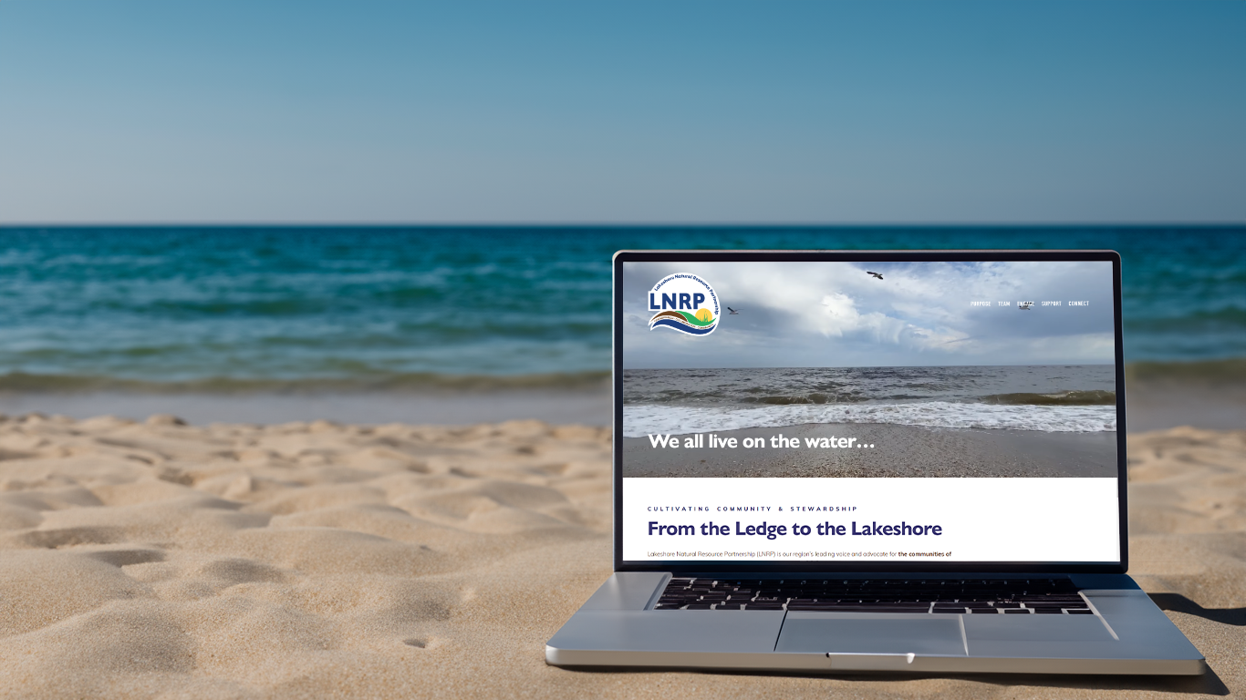
From the Ledge to the Lakeshore, a New Landing for LNRP’s Website
CLIENT
Lakeshore Natural Resource Partnership
LOCALITY
Northeast, Wisconsin
DATE
September 2019
CATEGORY
Website
TYPE
Website, Graphic Design
SERVICES PROVIDED
Website - Y and Website - K
MEDIUM
Squarespace
STATUS
Current Project + Live
LNRP, a large umbrella non-profit, was seeking to refresh its outdated website with something that would get people engaged, provide benefits to their partners, and improve their efforts of conservation in Northeast, Wisconsin. Online properties can be a great resource for organizations, and using Squarespace allows LNRP staff members to make minor updates on their own. Each year ZFMK Creative helps continue this transformation with larger updates and new features.
LNRP.org stands as a testament to modern and intuitive web design. Crafted with a keen eye for aesthetics and user experience, this website seamlessly balances functionality and visual appeal. From the moment each guest lands on the homepage, a sense of professionalism and purpose exudes, drawing visitors into the captivating world of LNRP.
The website's user-friendly interface ensures effortless exploration. Every element aligns harmoniously, from the cohesive color scheme to the thoughtfully arranged content blocks, reflecting meticulous attention to detail. The intuitive menu structure effortlessly guides visitors through various sections, providing a smooth and engaging journey.
LNRP Website Pages
121 PAGES 97 BLOG POSTS ONLINE GIVING 1 MERCH STORE
What sets LNRP.org apart is its responsive design, adapting seamlessly to different devices and screen sizes. The website maintains its elegance and usability, whether accessed on a desktop, tablet, or smartphone. This adaptability is crucial in an era where online experiences are accessed across a multitude of devices.
The integration of multimedia elements enhances the overall impact. High-quality images and well-chosen graphics complement the content and add depth and authenticity to the narrative. The judicious use of white space keeps the layout uncluttered, enabling information to breathe and creating a pleasing visual rhythm.
Navigating deeper into the website reveals the intricate attention given to each section's design. The commitment to consistency in typography and spacing ensures a cohesive visual identity throughout. The typography choices, in particular, enhance readability and contribute to a polished, professional feel.
Furthermore, LNRP.org brilliantly aligns design with functionality. Interactive elements such as contact forms, social media integration, and call-to-action buttons effortlessly guide visitors toward meaningful engagement and the content they seek. This interplay between aesthetics and purpose underscores the website's effectiveness as a communication tool. This will continue to evolve as the website receives new features and ways to integrate the growing content LNRP is creating.
LNRP.org is a masterful blend of design finesse and user-centric functionality. As the creative mind behind this captivating digital space, ZFMK Creative has seamlessly translated the essence of LNRP's mission into an engaging online experience. Our dedication to creating an impactful platform is evident in every pixel, and this project undoubtedly shines as a remarkable addition to our portfolio. Luckily, this is not the final stage of the project as we continue to work with the LNRP team each month to improve and design new features you will see into the near future.
“ZFMK Creative consistently delivers high quality work and creative solutions that exceed our expectations.”


